Image Optimization in 2026: WebP, AVIF & Lazy Loading Guide

Why Image Optimization Still Matters for SEO in 2026
You've refined your content strategy, nailed your metadata, and built a beautiful site — but your pages still feel sluggish. More often than not, unoptimized images are the hidden culprit dragging down your SEO scores.
Google's Core Web Vitals continue to influence search rankings in 2026, and images sit at the center of two critical metrics: Largest Contentful Paint (LCP) and Cumulative Layout Shift (CLS). A hero image that loads slowly tanks your LCP; one served without explicit dimensions causes layout jumps that destroy your CLS score.
The stakes are real. Pages that hit "Good" thresholds across all Core Web Vitals see measurably higher click-through rates and lower bounce rates. If you're running a JavaScript-heavy SPA, image performance compounds an already fragile rendering situation — issues you can audit quickly using the Core Web Vitals Analyzer to get SPA-specific LCP, CLS, and INP diagnostics with actionable fix suggestions.
Understanding Modern Image Formats: WebP and AVIF
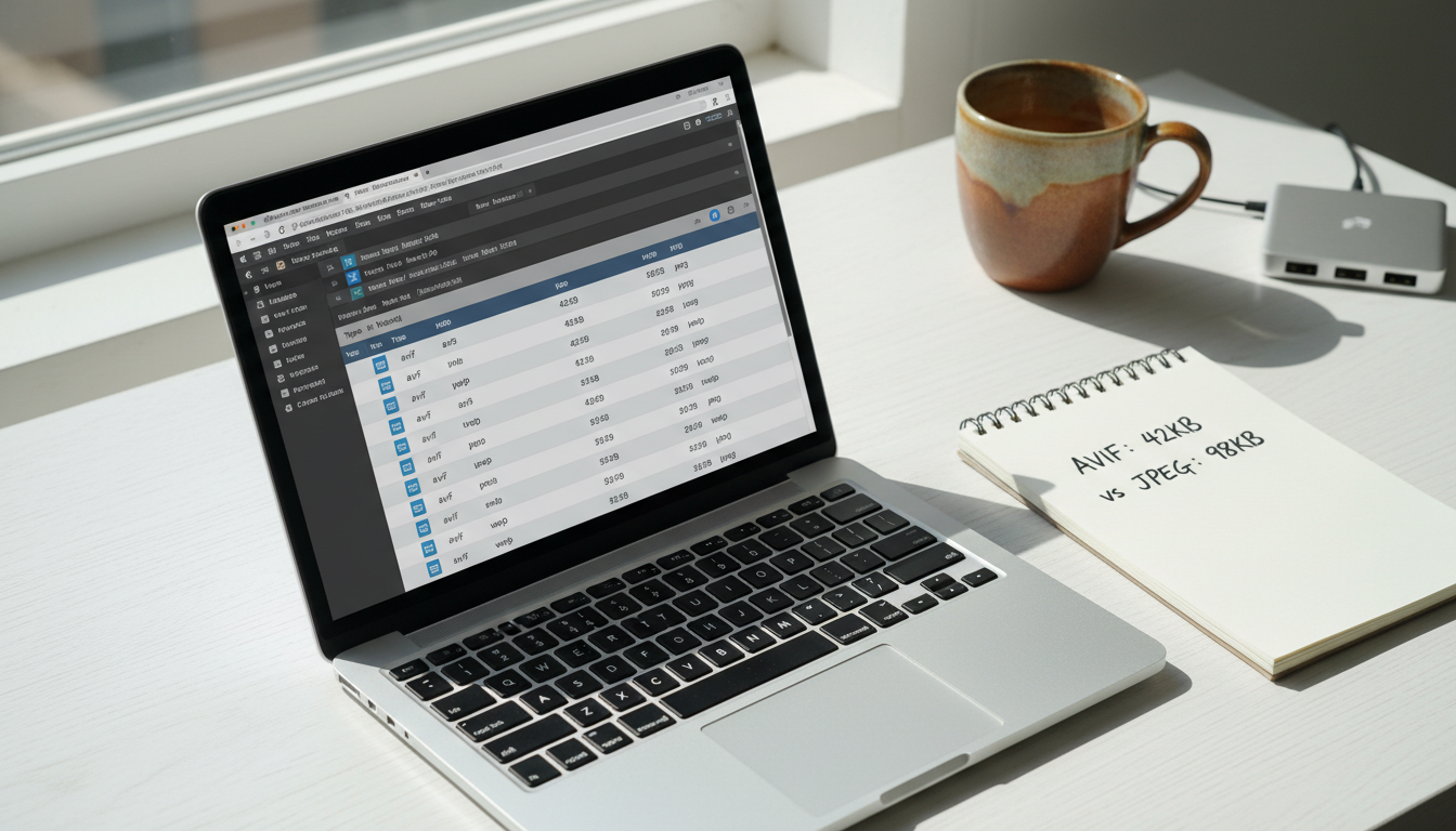
JPEG and PNG dominated the web for two decades, but they weren't designed for today's high-resolution screens and bandwidth-conscious mobile users. In 2026, WebP and AVIF are the formats you should be defaulting to — and the browser support gap that once held them back is essentially gone.
Both formats deliver smaller files without sacrificing visual quality, which directly translates to faster load times and better SEO. The question is no longer whether to use them, but which one to use and when.
WebP: Broad Compatibility and Solid Compression
WebP enjoys near-universal browser support — over 97% of global users can render it natively. It typically delivers 25–35% smaller file sizes compared to equivalent JPEG images, with excellent quality retention for both photos and graphics.
For most projects, WebP is the safe default. Tooling is mature: Google's cwebp CLI, the browser-based Squoosh app, and CMS integrations (WordPress, Contentful, Sanity) all handle WebP conversion automatically. If you're on a CI/CD pipeline, Sharp for Node.js is the go-to library for batch conversion.
AVIF: Superior Compression With Growing Support
AVIF is the newer contender, and its compression numbers are genuinely impressive — files can be up to 50% smaller than JPEG and around 20% smaller than WebP at comparable quality. It also supports HDR and wide color gamuts, making it ideal for photography-heavy sites.
The trade-off is encoding speed. AVIF is significantly slower to encode than WebP, which matters at scale. Browser support is excellent in Chrome and Firefox but still limited in Safari on older iOS versions. Use AVIF as your first-choice source in a <picture> element with a WebP fallback, so you capture the wins where support exists.
Choosing the Right Format: A Practical Decision Guide
Use this quick framework to pick your format stack:
Photographs and complex images: Serve AVIF first, WebP as fallback, JPEG as last resort.
Graphics with transparency: WebP (lossless) replaces PNG effectively; AVIF also supports alpha but encodes slower.
Logos and icons: Use SVG wherever possible — no raster format beats a vector for sharp rendering at any size.
Server resources are limited: Pre-encode AVIF during your build step rather than on-the-fly to avoid runtime bottlenecks.
Lazy Loading Best Practices for 2026
Lazy loading defers the download of off-screen images until the user is about to scroll to them. The benefit is immediate: your initial page load transfers only the assets the user actually sees, shrinking time-to-interactive and improving LCP for above-the-fold content.
Done correctly, lazy loading can cut initial payload by 40–60% on image-heavy pages. Done wrong, it actively hurts your Core Web Vitals scores.
Native Lazy Loading vs JavaScript-Based Solutions
The HTML loading="lazy" attribute is supported in all modern browsers and requires zero JavaScript. It's the right default for most below-the-fold images — simple, performant, and maintenance-free.
JavaScript-based approaches using the Intersection Observer API give you finer control: custom thresholds, progressive blur-up effects, and integration with component lifecycle hooks in React or Vue. Reach for JS-based lazy loading when you need that level of control or when you're loading images inside scroll containers where native lazy loading can behave unexpectedly.
Avoiding Common Lazy Loading Mistakes
The most damaging mistake is lazy loading your LCP image — typically the hero image or the largest above-the-fold element. This forces the browser to delay the most important visual asset, directly worsening your LCP score.
Two other mistakes kill CLS: omitting width and height attributes (the browser can't reserve space before the image loads), and over-deferring critical assets in carousels or hero sections. Here's the correct pattern:
<!-- Hero image: NEVER lazy load, always eager -->
<img
  src="hero.avif"
  alt="Team collaborating in modern office"
  width="1200"
  height="630"
  loading="eager"
  fetchpriority="high"
/>

<!-- Below-fold image: safe to lazy load -->
<img
  src="feature.webp"
  alt="Dashboard screenshot"
  width="800"
  height="450"
  loading="lazy"
/>
Implementing Image Optimization in Your Website Design Workflow
Understanding the theory is one thing; integrating it into a real website design workflow is another. The key decision is build-time vs runtime optimization. Build-time conversion (during your CI pipeline) is faster at serve time and cheaper on compute; runtime conversion (on a CDN or image API) is more flexible but adds latency on first request.
Using srcset and the picture Element for Responsive Images
The <picture> element lets you declare multiple sources so the browser selects the most appropriate format and size for each device and viewport. Here's a production-ready example:
<picture>
  <!-- AVIF for modern browsers -->
  <source
    srcset="hero-400.avif 400w, hero-800.avif 800w, hero-1200.avif 1200w"
    sizes="(max-width: 600px) 400px, (max-width: 1000px) 800px, 1200px"
    type="image/avif"
  />
  <!-- WebP fallback -->
  <source
    srcset="hero-400.webp 400w, hero-800.webp 800w, hero-1200.webp 1200w"
    sizes="(max-width: 600px) 400px, (max-width: 1000px) 800px, 1200px"
    type="image/webp"
  />
  <!-- JPEG last resort -->
  <img
    src="hero-1200.jpg"
    alt="Developer reviewing analytics on dual monitors"
    width="1200"
    height="630"
    loading="eager"
    fetchpriority="high"
  />
</picture>
Automation Tools and CDN Solutions
Manual format conversion doesn't scale. These tools handle it automatically:
Cloudinary & ImageKit: URL-parameter-based transformation APIs — append
f_auto,q_autoand they serve the best format for each browser.Next.js Image component: Built-in WebP/AVIF conversion, lazy loading, and srcset generation. Zero configuration for most use cases.
Astro's image integration: Build-time optimization with Sharp — perfect for content-heavy static sites.
Vite / Webpack plugins: vite-imagetools and imagemin plugins automate conversion during your existing build pipeline.
Measuring the SEO and Performance Impact
Optimization without measurement is guesswork. Start with Google's PageSpeed Insights and Lighthouse to identify your LCP element, flag oversized images, and get format recommendations. Chrome DevTools' Network panel lets you compare before/after payload sizes with precision.
Track these metrics before and after your optimization work:
LCP: Aim for under 2.5 seconds. Image optimization is typically the fastest lever.
CLS: Target under 0.1. Adding explicit dimensions to every image is the single biggest fix.
Total page weight: Switching a page from JPEG/PNG to WebP/AVIF commonly reduces image payload by 40–60%.
Bandwidth savings: Monitor via your CDN dashboard — savings compound at scale across thousands of daily visitors.
For SPA developers, remember that image SEO doesn't exist in isolation. If Googlebot is rendering an empty HTML shell instead of your actual content, even perfectly optimized images won't help your rankings. You can check exactly what crawlers see — versus what users see — with the Google vs Browser View tool, which surfaces the rendering gap in seconds.
Key Takeaways: Your 2026 Image Optimization Checklist
Run through this checklist on your next audit:
Format selection: Serve AVIF + WebP fallback for photos; WebP lossless or SVG for graphics and logos.
Hero image treatment: Never lazy load your LCP image. Add
loading="eager"andfetchpriority="high"explicitly.Dimensions always: Every
<img>tag needs explicitwidthandheightto prevent layout shift.Responsive markup: Use
<picture>withsrcsetandsizesso browsers download only what they need.Automate conversion: Integrate Cloudinary, ImageKit, or a build-time Sharp pipeline — don't convert images manually at scale.
Measure after every change: Validate LCP, CLS, and total page weight improvements with Lighthouse and PageSpeed Insights.
Check your full SEO picture: Image performance is one layer. Run a full SPA SEO audit to catch issues across metadata, rendering, and structured data at the same time.
Image optimization is one of the highest-ROI technical SEO investments you can make in 2026 — the changes are well-defined, the tooling is mature, and the ranking impact is measurable. Start with your LCP image, adopt WebP and AVIF across your asset pipeline, and let automation handle the heavy lifting.
And if your site is a JavaScript SPA, make sure search engines can actually read the content you've worked so hard to build. RndrKit pre-renders your SPA pages for Googlebot, Bingbot, and AI crawlers — so every well-optimized image and carefully crafted meta tag actually gets indexed. It's the missing layer that makes all your other SEO work count.
Fix your SPA's SEO automatically
RndrKit pre-renders your pages so search engines see fully-rendered HTML.
Start Free Trial